Monday, 22 March 2010

Audience Feedback

After I completed the main task and the ancillary texts, I targeted my audience for feedback. I simply asked the actors and actresses who featured in the media product and other people of the same age. This is the response they had on my media product:

- the part with the three girls in the park laughing is effective as it looks natural
- the music seems relevant to the piece and the tone
- looks professional
- looks like a TV programme
- the music sounds like a real tv show.
- I like the beginning and end shot where the characters come towards the screen as it gives it a unique style
- the font is good because it looks like it belongs to a children's TV drama genre
- I thought the timing overall was effective as you were able to read everything and the bold made it stand out against the images
- font style suits the pace of the music and characters
- some shots look more natural than others and the natural shots attract the attention the most
- the bold colouring accentuates the emotions within the character, emphasizing that it's a energetic and enthuastic programme
- the 'flashy' editing, shapes and colours make the piece stand out
- there were differences of opinion on the font choice - older ages of the target audience did not like it, in contrast to the younger ages of the target audience

The audience feedback that I gathered from the target audience was significant in underlining the improvements that could have been to, in particular, the main text. While the feedback was mostly positive, there was also a mixture of negative comments and suggestions on what could have been improved to make the final product more effective. The majority of people asked liked the ‘natural’ shots as they were said to increase the verisimilitude by making the audience believe that the gang were a genuine group of friends, and this helped the audience form a connection with the characters as individuals and as a gang. The shot that was said to have been most natural was the mid shot of the girls laughing and therefore, to improve my product, I could have used more natural shots to reinforce the relationship of the gang as a whole, and the relationships within the gang. Moreover, the younger ages of the target audience (8-12 year olds) stated that they liked the font choice as it connected with the genre, whereas the older ages of the target audience (13-16 years old) didn’t like the text as much, and this shows the differences between the ages of the audience and that more consideration should have been taken into meeting the needs of the viewer.

Final Main Task

Friday, 19 February 2010

Ancillary Tasks

Having made some sketches of ideas for a DVD cover and a magazine cover, I started to work on them in Adobe Photoshop. I began by finding a DVD template and then using photographs and using the same font that was used in the opening of the TV drama.


This is the very basic DVD cover that I have started to put together, it is not finished yet as there are still areas missing and I will add some effects to the images and text. However, this may give a feel of the type of DVD I am aiming for and the final look. Having started this, I have a positive idea towards the DVD cover and its final look, but I still think I need more practice with using the effects in Photoshop effectively. Moreover, when completing textual analysis and looking at other DVD cover's from the same genre, I noticed that the design of most was quite basic - very little effects were used, instead a particular font was chosen and a few photographs of the drama.

Thursday, 18 February 2010

Filming - 18 February

Today I completed new shots and re-shoots and this was successful.

Shots I completed:
- new shots of the girls and boys separated to create a more friendly feel in the group
- took an alternative of the jumping shot - a mid shot instead of a long shot
- new shot of Steph and Henry walking towards the camera whilst holding hands to reinforce their relationship through a different shot
- Emily's shot has been completed with better lighting and framing
- the walking shots were also changed, so the characters now walk past and towards the camera, allowing the audience to feel more connected-
- along with filming, I also took some photographs of the 'gang' to go towards the ancillary tasks

Overall, I feel today's filming was effective; the shots that I have completed will hopefully add more personality to the piece and allow the audience to connect with the characters much more, as before there was a lack of connection between the characters and the audience. Moreover, as many of the shots are now either a close up or a mid shot, this should be effective as it shows that the codes and conventions of children's TV drama have been taken into consideration closely. However, I could have taken more photographs of the 'gang' to help with the DVD cover and the magazine cover as the photos I have lack variety, but from mocking up ideas, I don't think this should be too much of an issue.

Tuesday, 16 February 2010

Photoshop Practice

As most of the class are unfamiliar with Photoshop, we starting to practice certain skills on the software.

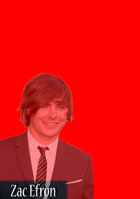
To begin with we took a photo of a celebrity from Google using a specific search and opened this in Photoshop. This was followed by cutting out the celebrity from the image and placing it into a new A4 size image. I used the Magnetic Lasso tool; being beginner of Photoshop I felt that this would be the most effective way of cutting the image out without any noticeable errors. In addition to this, once the image was placed on the new A4 image, we used the text tool and inserted text over the image and then created a text box - adding a shadow effect to it and also adding effect to the celebrity by changing his opacity.

Practice 1...


In another lesson, we were given cameras and took photos of each other and imported one of the photos into Photoshop to do a similar task and to strengthen our skills on Photoshop. Similarly to the celebrity image, I used text over the image but added a shadow to the text and also added a shadow to the photograph, but the shadow was created by duplicating the image and changing the brightness/contrast levels.

Practice 2...

Monday, 25 January 2010

Codes and Conventions - Secondary Media

As beginning the ancillary tasks is approaching, I have completed research into the codes and conventions of my secondary media - a DVD cover for the series and the front cover for the magazine series. I have chosen specific children's TV drama series to give me an insight into the common features of DVD covers and magazine covers for the series. Particularly looking at Saved by the Bell and Everybody Hates Chris, as they were strong influences of my final piece.

Codes and Conventions:
- the main characters are typically centered in the piece
- a logo or a unique font is always evident so the audience visually recognise the series
- a small amount of writing, most attention is on the visual imagery
- quite basic techniques are used, which makes it easy for the young audience to associate with
- bright colours
- an obvious relation between the covers and the series itself should be evident

Textual Analysis:


I have completed some initial textual analysis of Everybody Hates Chris to give me a starting point for my ancillary tasks. I have now have an effective idea of the codes and conventions and will now begin to create some initial ideas for possible pieces. I will analyse more series, such as Saved by the Bell, Grange Hill and Sabrina The Teenage Witch so I have a significant understanding of how I can create an effective DVD/magazine cover.

Saturday, 23 January 2010

Feedback

I received feedback from my teacher highlighting the areas that needed change to create a piece with codes and conventions evident, and to engage the target audience more:

- Improve the generated background from After Effects as it causes distraction and doesn't entirely fit with the piece
- The opening shot of the gang walking changed from an ELS to a MLS and have the gang walk closer to the camera to add a character engagement with the audience
- Shot 4's size to be reduced slightly to fit with the first shot of the character
- Shots 5-8 change the background to all pink to keep with the colours signifying gender and keeping to stereotypes
- Change the text colour of shot 6
- Shot of Heather is too far away, change to a CU or MS
- Shot of Emily is poorly framed and the lighting could be better - re-shoot
- Football shot doesn't work in the piece and the same for the shot of the girls laughing - create more effect by changing location so the boys and girls are laughing/messing around
- The shot of the gang walking back needs to be centralised
- Final shot to be changed to a close up of them jumping

To stick to the codes and conventions of the children's TV drama genre, I need to use close ups and mid shots of the characters as this is typically used in this genre to create an engagement with the characters and the audience. This is especially evident in Saved by the Bell. It was also established that the background music that has been chosen is not the right tempo to engage viewers as it becomes quite monotone, therefore I will aim to find a more up-tempo piece of music for the final piece.

So far I am happy with the progress that is being made towards creating a final piece; from gathering a variety of feedback I am aware of how I can show that I have paid close attention to the codes and conventions of the genre and I have a clear plan and idea of what to re-shoot/shoot, what to alter and what to add to create an effective piece. I do feel that such areas as the music and the generated background used from After Effects could have been altered earlier, but I still feel that progress is going well.