Saturday 21 November 2009

Rough Cut


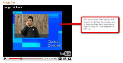
This is my rough cut for my children's TV drama opening. From watching my rough cut and gaining feedback from the teacher, I have instantly recognised the changes that I need to make for the final piece.

Main changes and improvements that need to be made:

- Music that builds the pace
- Less zoom on characters
- Title at the beginning needs to be more prominent
- Increase font size to avoid distraction
- Action based montage at the end

The main response to my rough cut is that it stays the same throughout - the footage and order of my piece flows, however there is little that builds the pace, most significantly the music, which inevitably loses the engagement of the audience. In addition to this, there is little action in my rough cut, therefore I need to add possibly a montage of action to give more of an insight into the gang, as it is quite easy to lose focus that this children's TV drama is fixating on a gang of friends. I will also alter the duration of time on each character - choosing two main characters within the gang that will be longer than the others; this will engage the audience in establishing the roles of each of the gang. Additionally, the length is longer than anticipated and with the action montage and other shots that will be added, I will need to ensure in the final piece that the length isn't too long - as children's TV dramas are typically under a minute in length. Furthermore, the titles I used proved to be ineffective; while I received positive feedback on the positioning and font of the titles, as there is so much going on in the background, it was easy to be distracted from the titles, making it difficult to read. Thus, I will stick to the positioning and font but make the text bigger for the audience.

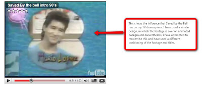
It is evident that I have used Saved by the Bell as an influence for my children's TV drama piece, this meant that I had to use a mixture of different software to create my rough cut. I predominantly used Adobe After Effects, and after creating the rough cut, I'm still learning new skills for ways to improve the piece. I aim to change the shape of the footage on screen, as this appears in only one shape throughout, so by changing the shape this makes it more interesting to view and will create a distinction between characters.

Comparison with Saved by the Bell:


Monday 9 November 2009

Shooting

First filming session - 8 November

I completed my first filming session, which went very well. I was able to shoot all the footage I needed to create a rough cut in time for the deadline and also get a feel of any location choices that I may need to change. I filmed two sets of characters at the same bench, and watching this back it is evident that I will need to re-shoot this at a different location for one of the characters. What's more, there were no issues with equipment or any actors/actresses unable to make it, and with all the filming I needed to get completed, I feel this was very successful.

Second filming session - 27 November

This filming session was also successful - from creating a rough cut and getting feedback, I knew what I need to re-shoot and any new shots that I needed to do. I re-shot certain shots that needed zoom to be removed and also changed location for a few, as well as improving lighting that affected the quality of certain shots. Again there were no issues on this filming session.

Sunday 8 November 2009

Images

From left to right: Kieran Mcdonald, Emily O'Connell, Stephanie Harding, Henry Warren, David Austin and Heather Casey


From taking this image of the 'gang' jumping, I have decided that this would be effective in my intro as an action shot; it would link in with children and create entertainment and increase the action in my intro.

Wednesday 4 November 2009

First character titles in Adobe After Effects

As I successfully made my main title for the children's TV drama, I moved onto creating the titles and individual shots for the characters being introduced. I was now able to use the software comfortably for the intended purpose, and had a feel for the style of the entire piece.

These are my first attempts at making the titles and background for the male and female characters. They will each be shown for 3-4 seconds. From watching the pieces, it is evident that the colours are different for each gender, this not only allows the audience to recognise the gender, but also connects with the stereotypical colours associated with the gender. For instance, I have chosen different shades of blue for the male characters and pink and orange for the female characters.

Having created these pieces, I have decided that there needs to be more added to the piece to engage the audience further, however when producing the final piece, I must ensure that any background animation I add doesn't distract the audience from the characters being introduced.

An example of a male character's piece


This is the first piece of the couple in the gang's shot
As both genders appear in this shot, I chose to combine the colours used in the separate gender shots. I have also chosen to use one colour as stronger to convey that the relationship is not equal. For example, in my first attempt more pink and orange is shown, which suggests that the female holds more power.


This is the first rough title I created that contains a shot of the character, in the final piece it will be shown for 3 - 4 seconds, allowing plenty of time for the audience to engage with the character and establish the representation that has been used.


Moreover, each of the character titles possesses a contrasting effect that gives each character a sense of individuality, and keeps the audience engaged; unlike my animatic, I have started to remove the repetition first seen in the animatic.

It is also evident that Saved By The Bell has played a heavy influence in my final decision to use animation within my children's TV drama intro, along with the way in which the characters are presented on screen. However, I have chosen a more modernised introduction than Saved By The Bell, but I must ensure that my intro isn't too similar.

The beginning of Our Gang

As I am creating an animated background and using colour and movement to engage the younger audience, I chose to use the software Adobe After Effects as a starting point to allow create the titles and enable to grasp the use of the software. Following the feedback from my animatic, I chose a title as 'Our Gang' - this was chosen as I feel conveys the narrative well, and people who viewed my animatic quickly established that the characters were part of a gang. In addition to this, 'Our Gang' is simple for the target audience to associate with.

I began by creating a main title...

The main title will be shown for 4-5 seconds to instantly engage the audience.


From watching the main title, I felt that the colours were too feminine, and this was reinforced with feedback from people who viewed the title. As the target audience is a young male and female audience it was essential that I changed the colours to attract both genders. Nevertheless, the font chosen for the title is effective in linking with the theme of youth and the title itself. I also changed the effect of the title to a bolder effect, which is instantly in the audience's vision when the intro begins.


Shot 2


I have chosen the same colour scheme as the main title shot for the second shot, containing the 'Produced By...' title. This highlights that they are both the main titles of the intro.